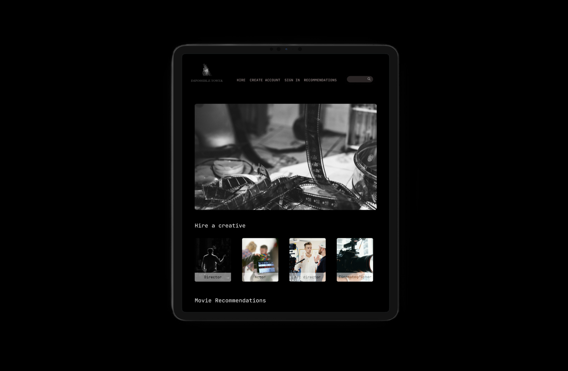
Impossible tower facilitates the hiring of creatives in the film industry
My role
Prototyping, UI Design, User research, Branding
Hiring cast and crew for films tends to be a tedious process.
Recruiting the right talent, at the allocated time is excruciating especially in an industry like film. Our main focus while working on the job portal was making sure the recruiting process was seamless for all parties involved.
The website has two use cases: hiring cast and crew and offering movie recommendations.
After establishing our two use cases; we then proceeded to define the shape of the website, we established users, user types, user permissions; what they can or can’t do.
We asked users to define what mattered most to them while hiring creatives and what they looked for when searching for movie recommendations so as to be able to work on the structure of the portal. From their replies we were able to shortlist three key points.
How big of a budget do i have for my project?
How many cast and crew will i need for the said project?
What is the scale for my project?
After several prototypes we ended up with a website architecture that encompassed both the hiring and movie recommendations, we defined how each step would look like.
The home page contained both hiring, joining and recommendations.
The hiring page went into details with partitions, allowing the user to get a better idea of who they were hiring. It was very important for us to specify and make it easy for the user to know which creative they were hiring.
The joining page allowed creatives to join the portal, by adding their name, photo, occupation, sample projects and emails.
Hire a creative had to be straightforward, with the option to see which creative you were hiring, what have they worked on and how much their rates are.
When it came to recommending films we decided to opt for a layout that would be clear to most users, our recommendations had to range from modern films, classics to noirs.
The sign up/sign in page allowed the user and gave the user an opportunity to quickly sign in/sign up without wasting any time. We added the cta to avoid friction and allow the user to flow through the tunnel without any obstruction.
Design system
For the website we had many screens, covering sign up, home page, hire a creative, join, recommendations and support. The design
system was designed with components that could be maintained over time.


